I got a response from a product consultant for Copic:
"The splotchiness you see is because paper is made out of fibers from trees, which, depending on the milling, absorbs ink differently.
Each marker brand reacts differently with the fibers of each paper brand. It also depends on the density of the dye particles for specific colors - so darker colors may not absorb in the same manner as light colors.
When magnified, yes, it is easy to see the grain from the markers/paper. This is a known issue, but it also a matter of the nature of the medium.
Colored pencils look a certain way, watercolors look a certain way, waterbased markers look one way and Copics look another. Whatever medium you choose to work with is up to you. If the results are not acceptable with one medium, then it is a personal choice."
So the way I read this is that the splotchiness, blotchiness, speckled inks are caused because the density of the dye particles in some of the Copic colors are different then the dye partical density in other Copic colors. These to me means the inks are not the same so they react differently to the same piece of paper. Which is shown in my test swatches in the previous posts. So the quality of the ink isn't consistant between markers..but if a person is lucky, they might happen to find a paper where the inconsistancy is minimized...that's a lot of work and expense just to find a paper where all Copics are happy.
While I appreciate the information that it is a known issue, that last paragraph seems a bit.....so if I don't like the "know issue", it's a personal choice.
I disagree. I think any artist or hobbyist who cares about their work and pays premium price for a proclaimed premium marker has the right to expect premium and consistent quality and not have to make a personal "choice" to accept less.
But she did bring up a point I did not address so I will here:
It doesn't take ANY magnification to see any of this speckling/mottling. I can see it on the 2x3 inch test swatch standing 5 ft away. The problem is obvious enough on it's own that it does not need any enhancement in any way.
None of the test swatches below were magnified - 2 of them are at real size and the rest of the scans are SMALLER than the actual size and the speckling is obvious.
So now we know. Copic's dark inks can absorb differently than their light inks and papers definitely enhance or minimize this known issue.
So lets get down to personal choices
Copic: expensive, hit and miss quality depending on the color, fussy with paper. If that is for you, then this marker is for you. In good conscience, cannot recommend them, especially when Copic knows about the issues and still charge the prices they charge.
Touch: affordable, loves almost all flavors of paper, consistent, premium inks in every color. I can give an honest, favorable opinion of these markers and recommend them for people who care about quality over a brand name.
I work too hard for my $ and I work to hard on my art and hobbies to pay extra money for speckled/mottled inks.
Monday, February 07, 2011


Saturday, February 05, 2011
Touch Marker English Website is UP!
ShinHan Arts now has their English website up! It mentions the refillable and replaceable nibs as well as brush markers! Check them out in the PDF catalogue
http://www.shinhanart.com/
http://www.shinhanart.com/
Copic Marker Review: Are Copics REALLY the Best?
I LOVE my markers! I love the colors and how easy they are to use. I have several brands of markers; Copic, Touch Twin, Dick Blick and no longer made Design markers. I recently updated my color swatch chart. While looking it over, I noticed that most of my Copics were splotchy and mottled looking compared to the Touch and Dick Blick swatches. Hmmm..Copics are considered the premium markers out there. There is a lot of really great tutorials on how to use them and classes available and so on. They are easy to find but not easy to afford, with prices from $3.50 to $7 for each marker.
ShinHan Touch Markers can be very hard to find information on and where to purchase. They are HUGE in the asian market and are made in Korea. I found them sold at Dick Blick and the price was much less, I got them for $2.09 per marker on clearance (ShinHan is coming out with a new marker style early summer 2011 which will be refillable and replaceable nibs as well as brush styles). I also got a few Dick Blick brand markers to fill in colors I didn't have. Touch are also available online at Pearl Arts, Jerry's Artarama and several people have good results on Ebay. Some stores carry them locally.
So back to the mottled Copics. I posted on Split Coast Stampers (SCS) asking if anyone knew why I was having this problem with Copic? I didn't get very many responses but had some good suggestions that it might be the paper, inadequate saturation or using not using enough ink, ect.
Well, I spent good money on these Copics and I really want them to work and look nice so I had better find out what is going on. I was given some different paper samples by some SCS so I decided to see if it is my paper and what more or less ink would do.
After seeing the Copic results, I decided to see how the Touch markers compare and also did one swatch with a Dick Blick marker.
Very interesting results...and not in Copics favor. But some very useful findings about what papers work better with Copics and which to avoid. Paper definitely has an effect on Copics, as you will see in the following pictures. They also effect Touch and Blick, but not to the degree as Copics.

Copic Blending: This is a smmmoooth paper. The markers move nicely on it. However, I found that all of the pens can leave puddle of wet ink on top. It quickly absorbs in but if someone isn't careful, I think they could smear this puddle before it dries. Mottling on G07, YG23, YG45, E44 Copics. Trace mottling on 47 and 100 Touch and DB. This mottling is a bit different. It almost looks like there are shiny areas embedded in the paper or maybe the slick coating on this paper isn't consistence. When this is looked at in person, it looks like shiny flecks.
 Gina K. heavyweight. This paper is VERY heavy! There is absolutely NO bleedthru on the reverse of the paper. It is fairly smooth feeling. However, I would NOT recommend this paper with Copics. As you can see, there is major mottling with the Copics, in every color. There is less noticeable mottling with Touch but still on an unacceptable level, with the worst being 47.
 Next is SU card stock. When I put my marker on this paper I said "awww..", the markers glide over this like skated on ice. I thought this would be it. But it's not. It is on the same level as the Gina K. above. Serious mottling in all colors. Not recommended for Copics at all.
ShinHan Touch Markers can be very hard to find information on and where to purchase. They are HUGE in the asian market and are made in Korea. I found them sold at Dick Blick and the price was much less, I got them for $2.09 per marker on clearance (ShinHan is coming out with a new marker style early summer 2011 which will be refillable and replaceable nibs as well as brush styles). I also got a few Dick Blick brand markers to fill in colors I didn't have. Touch are also available online at Pearl Arts, Jerry's Artarama and several people have good results on Ebay. Some stores carry them locally.
So back to the mottled Copics. I posted on Split Coast Stampers (SCS) asking if anyone knew why I was having this problem with Copic? I didn't get very many responses but had some good suggestions that it might be the paper, inadequate saturation or using not using enough ink, ect.
Well, I spent good money on these Copics and I really want them to work and look nice so I had better find out what is going on. I was given some different paper samples by some SCS so I decided to see if it is my paper and what more or less ink would do.
After seeing the Copic results, I decided to see how the Touch markers compare and also did one swatch with a Dick Blick marker.
Very interesting results...and not in Copics favor. But some very useful findings about what papers work better with Copics and which to avoid. Paper definitely has an effect on Copics, as you will see in the following pictures. They also effect Touch and Blick, but not to the degree as Copics.
All papers are layed out the same way - Copics on top, Touch below and the Lilac is Dick Blick. Each color has the same number of strokes, the darker part of the color has 3 strokes, the lighter shade at the bottom is a single stroke. Looking at the back of the papers, they are all saturated at the same level. I have picked out the closest in color and hue of my Touch markers to match my Copics.
To define the problem clearer, I am finding Copic inks "mottle" when they dry. This means that the ink had lighter or white specks throughout, rather than consistent coverage.
 PTI 110 - Obvious mottling on G07, YG 23 and YG 45 Copic. Some mottling on Touch 100 and maybe a tad in 102, but at acceptable level. DB (Dick Blick) looks pretty good also.

Copic Blending: This is a smmmoooth paper. The markers move nicely on it. However, I found that all of the pens can leave puddle of wet ink on top. It quickly absorbs in but if someone isn't careful, I think they could smear this puddle before it dries. Mottling on G07, YG23, YG45, E44 Copics. Trace mottling on 47 and 100 Touch and DB. This mottling is a bit different. It almost looks like there are shiny areas embedded in the paper or maybe the slick coating on this paper isn't consistence. When this is looked at in person, it looks like shiny flecks.
 Gina K. heavyweight. This paper is VERY heavy! There is absolutely NO bleedthru on the reverse of the paper. It is fairly smooth feeling. However, I would NOT recommend this paper with Copics. As you can see, there is major mottling with the Copics, in every color. There is less noticeable mottling with Touch but still on an unacceptable level, with the worst being 47.
 Next is SU card stock. When I put my marker on this paper I said "awww..", the markers glide over this like skated on ice. I thought this would be it. But it's not. It is on the same level as the Gina K. above. Serious mottling in all colors. Not recommended for Copics at all.
 BUT...the Touch markers and DB worked pretty good with this paper. Slight mottling in the darker colors, nothing in the lighter colors.
 Wausau/GP - I think this is available at Walmart but I could be wrong. It isn't the brightest white and I would not use it with Copics. Like SU and Gina K. above, it doesn't play well with Copics. Obvious mottling in all colors.
 Wausau/GP - I think this is available at Walmart but I could be wrong. It isn't the brightest white and I would not use it with Copics. Like SU and Gina K. above, it doesn't play well with Copics. Obvious mottling in all colors.
 Touch - does pretty good with Touch and DB markers. Colors don't look quite as bright on this paper as the others. I think it suck in more ink than the other pages also.
 Papertrey PTI medium. This has the roughest feel of all my samples, but it's a keeper. Copics look pretty good on this paper, mild mottling in the darker colors. Touch and DB look great. All colors are nice and bright.
 Neenah Classic 80. Obvious mottling with Copics in all colors except R17 and slight in YR68. I would not recommend with Copics because it is very obvious in the greens.
 Papertrey PTI medium. This has the roughest feel of all my samples, but it's a keeper. Copics look pretty good on this paper, mild mottling in the darker colors. Touch and DB look great. All colors are nice and bright.
 Neenah Classic 80. Obvious mottling with Copics in all colors except R17 and slight in YR68. I would not recommend with Copics because it is very obvious in the greens.
 Works well with Touch and DB, mild mottling in 100 and DB but not on a noticeable level.
 Copic X-Press. Same problem but as Copic Blending but even more. Looks like flecks in the paper, almost like mica flecks in a rock. At first glance, it looks like mottling but on closer inspection, it is flecks in the paper. But they are noticeable and are seen more with the Copics than with Touch markers. DB is too small to evaluate.
 Copic X-Press. Same problem but as Copic Blending but even more. Looks like flecks in the paper, almost like mica flecks in a rock. At first glance, it looks like mottling but on closer inspection, it is flecks in the paper. But they are noticeable and are seen more with the Copics than with Touch markers. DB is too small to evaluate.
 So white spots due to flecks in the paper, which are obvious with Copics.

Bienfang Smooth Bristol Board. This is one of the better/best paper for Copics. Mild mottling, the most noticeable is G07. Touch and DB look very nice, no mottling.
Final Thoughts.

Bienfang Smooth Bristol Board. This is one of the better/best paper for Copics. Mild mottling, the most noticeable is G07. Touch and DB look very nice, no mottling.
This is what I think is going on with Copic inks. These are alcohol based inks. The alcohol carries the pigments and then it evaporates off the paper. As I watched the Copic inks dry, it seems to me that the alcohol might be "puddling" in the light/white areas and there is more alcohol than pigment in the puddle. When the alcohol evaporates, it is lighter or whiter because there was less pigment
Final Thoughts.
Copic need to improve their quality. The quality of ink is not worth the price people are paying. And limited papers that work with these fussy markers just adds to the expense.
Some people have hinted that this is just happening to me...well..no because I found it right on Copic's very own website. Check out the dark side of the cube (E44). http://www.copicmarker.com/tutorials
I understand how people love their Copics, especially if they have never tried any other artist marker brands and have paid big bucks for their collection. If you are happy with your Copics, please continue to be happy with them, I'm not telling you to stop. But before bashing me (yes, I have been bashed for my opinion), try your own tests with an honest evaluation.
I will continue to be happier with my Touch markers - better quality, value and consistency.
Thursday, February 03, 2011
Pink Lady

I really enjoy Samantha Hahn(.com)'s watercolors. This is my version of one of her watercolors but I since I don't watercolor, I used my lovely markers.

I used my Shinhan Touch alcohol markers, Dick Blick Coral Pink marker (worked OK but Touch markers are better) and Beinfang marker paper (which I don't like but need to use it up).
She was fun to draw!
Tuesday, February 01, 2011
Dream it Up!

This is what I whipped out. It certianly isn't going to be a cover of a book. I really don't know if that is doable.
Anyway, I started this with my Inktense pencils but I just don't have enough experience with when it comes to painting with them, so I grabbed a regular #2 pencil and did a lot of rubbing with my finger to blend. Now I have a sore finger :) I couldn't get the dark's any darker, I guess I will have to get some graphite drawing pencils.
I want to try this with my Touch markers but I don't have the right range of grey. But if I did, I think I could do a fairly reasonable job with them and I know how to blend with those.
Life is about to get much busier, I've got my tickets booked to go to Phoenix for my final certification and then a year long apprenticeship type followup. I have to start reading the training materials now because it is a few thousand pages of Soc Sec policy and stuff like that. That's the government for you, they LOVE their policy manuals.
TaTa for now :)
Monday, January 31, 2011
WOW..I don't know..

A very old friend contacted me yesterday and wants me to do an illustration for the cover of the second book she is publishing...
Huh? I had to check to make sure she meant to send that email to me. Yep, she did.
I'm floored.
After big warnings that I have only drawn people two times EVER in my life, she still wants me to try.
I guess it can't hurt to try.
So here is a very, very rough sketch I have come up with - it is an outline only, no details or shading yet.
So now I'm fighting the fear that I'm totally going to mess it up.
But I can try anyway, right?
The worse that can happen is that she will have to find someone else to do her cover.
Friday, January 28, 2011
Complete..sort of
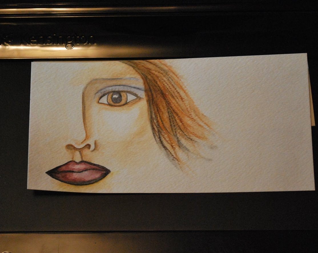

I decided to finish my lady. Well, finish as much as I can on the mis-centered paper. I'm OK with it be off center, I like it like that. Just like I like the cracked wings on my flying hearts, those things seem to work for me :) I think I will fill in the hair at the bottom right more and maybe I will put some bicycles floating around in the space to the right of her..hmm. Excuse the crooked picture. I had a hard time photographing it today.
I had a white chocolate mocha at about 9pm last night..not the smartest beverage choice. I'm awake and tired at the same time. I think I will get up and actually do something like laundry..did I just type that outloud? haha.
Incomplete

My first attempt with my Derwent Inktense watersoluable ink pencils. I have never watercolored before so my technique is rough and I'm new to drawing/painting anyway, so I was making my own version of a face I found in the internet. I have a fear of messing up a good thing so I stop, even if it's not complete, which is what has happened here.
My husband, a college educated artist, says he's going to get me over that and teach me how to waste paper. He says he will push me and if I mess it it, throw it away and start over...ugh..that will be hard for me. Since he can't work right now because of a seriously broken right hand *he is right handed* and can't draw or do much of anything, he is going to PUSH me. He says I would be eaten up in a college art class, not because of my ability or inability, but because of my fear. Which explains why I never took any art classes EVER! This will be a a good thing, right?
So for right now, my Inktense lady will remain imcomplete. I will look at her for a few days and decided to keep her that way or to try and complete it. I am much more comfortable with my Touch markers, I know how they will behave. Adding water is a totally different ball game.
Thursday, January 27, 2011
Rose Record Keeper


 I made up an organizer folio using a manila file folder and covered it with designer papers. When I first got this pack of paper, I thought it was a valentine theme but it turned out to be sort of an Eclipse theme. I am not into vampires or Eclipse, I never been into scary things and romance with the undead just doesn't do it for me - go figure, haha. Needless to say, when I got home and realize what this paper pack was, I was disappointed for not taking a closer look at it and thought I had wasted my money. It also has splotches on the papers like dripped blood - ick. Not a feel good image.
 But happily, I was able to cut off parts of some of the papers I didn't care for and was able to make up this nice organizer. The front pocket holds 2 notepads - one for appointments and the other is a TO DO list (I have put post it notes to cover up my entries, my todo list isn't very interesting :) , the second pocket is a calendar with space below for notes, the third is an address book and the last will have an envelope in which I will place receipts and papers. I colored the edges and the spine with Old Red 2 ShinHan Touch marker. Looks great and has a nice weight and feel to it. Secure it closed with gold elastic and it's ready for use!
There are still some papers which I really don't like nor will ever use so I will get rid of them after salvaging what I can.

I edged my rose a bit more with 34 Yellow Touch marker and it looks really pretty, but I should have done it before assembling the rose. I have glued it to the cross on the cover of my homemade prayer/scripture/meditation journal. Girly glam. :)
Wednesday, January 26, 2011
What I've been doing Lately


I've been not doing a whole lot!
But I am finally set up to head out to Phoenix at the end of Feb for a 4 day certifcation class with Virginia Commonwealth University. Even though I finished up with Cornell University, VCU is the only agency which has a contract with SSA and since I will be paid by agencies which are reimbursed by SSA for my benefits counseling services, I must get this certification.
After the training, I will be going to get checked out at Mayo Clinic. Hopefully they can figure out why I am having dizziness and can get me back on track. Mentally, I am more than ready to get back on my bike but the body isn't in agreement yet. Come on, already!
I am working bit by bit on my Art journal, it's just stuff for me. I really would like to get some black gesso and white stamping ink - it's a cool look. And I would really like to get some Derwent Coloursoft Pencils from Dick Blick, which has the cheapest price for a set of 72 pencils. I asked for dontations on FB but no one has contributed, haha...darn!
I could get black gesso and the pencils and it would probably be about $100 with shipping - if anyone wants to contribute to the hobby that is keeping me sane...I'm just sayin..:)
I am not a ribbon, flowers and lace type girl - blame it on being the youngest kid and only girl born in my family in 5 generations, - one would think that would cause me to be raised as a girly girl but no, I played hockey, not barbies. Anyhoo, I like the look of the flowery, lacy albums that I see posted online and think that I would like to set out of normal zone and give it a go. But I don't have lace, ribbons, flowers, girly stuff. And I can't buy any right now if I'm ever going to get some Derwent pencils. So I found a SVG cut and tutoral by Penny Duncan and made one of her roses.
I used GP white cardstock and colored it with my Touch markers: 45 Canaria yellow and 35 Lemon yellow for the rose, 59 Pale Green and 175 Lime Green for the leaves. This cardstock is really too heavy, it was hard to roll, too stiff. I used my hot glue gun, which I haven't used in ages and it's really nice to have it adhere and dry right away. I touched it up with some Pearl Ex, which I've never used before. Gave it a nice shimmer. I'm overall happy with it but need a lighter weight paper, then I will make more.
Maybe I will even make a PINK one and glue it to some LACE! Wow, that would really be stepping outside my box! Well, sort of, one of my bicycles is pink, so I guess a pink rose isn't too much of a stretch but the lace certianly is - and I would have to buy some lace..hmm.
But I am finally set up to head out to Phoenix at the end of Feb for a 4 day certifcation class with Virginia Commonwealth University. Even though I finished up with Cornell University, VCU is the only agency which has a contract with SSA and since I will be paid by agencies which are reimbursed by SSA for my benefits counseling services, I must get this certification.
After the training, I will be going to get checked out at Mayo Clinic. Hopefully they can figure out why I am having dizziness and can get me back on track. Mentally, I am more than ready to get back on my bike but the body isn't in agreement yet. Come on, already!
I am working bit by bit on my Art journal, it's just stuff for me. I really would like to get some black gesso and white stamping ink - it's a cool look. And I would really like to get some Derwent Coloursoft Pencils from Dick Blick, which has the cheapest price for a set of 72 pencils. I asked for dontations on FB but no one has contributed, haha...darn!
I could get black gesso and the pencils and it would probably be about $100 with shipping - if anyone wants to contribute to the hobby that is keeping me sane...I'm just sayin..:)
I am not a ribbon, flowers and lace type girl - blame it on being the youngest kid and only girl born in my family in 5 generations, - one would think that would cause me to be raised as a girly girl but no, I played hockey, not barbies. Anyhoo, I like the look of the flowery, lacy albums that I see posted online and think that I would like to set out of normal zone and give it a go. But I don't have lace, ribbons, flowers, girly stuff. And I can't buy any right now if I'm ever going to get some Derwent pencils. So I found a SVG cut and tutoral by Penny Duncan and made one of her roses.
I used GP white cardstock and colored it with my Touch markers: 45 Canaria yellow and 35 Lemon yellow for the rose, 59 Pale Green and 175 Lime Green for the leaves. This cardstock is really too heavy, it was hard to roll, too stiff. I used my hot glue gun, which I haven't used in ages and it's really nice to have it adhere and dry right away. I touched it up with some Pearl Ex, which I've never used before. Gave it a nice shimmer. I'm overall happy with it but need a lighter weight paper, then I will make more.
Maybe I will even make a PINK one and glue it to some LACE! Wow, that would really be stepping outside my box! Well, sort of, one of my bicycles is pink, so I guess a pink rose isn't too much of a stretch but the lace certianly is - and I would have to buy some lace..hmm.
Saturday, January 22, 2011
Art Journal


I made myself an art journal last night, using my new Cinch to bind it. I also was in a winged heart mood so I whipped out a bunch of different colored hearts.
It was interesting trying to ink the black heart to show dimention, I'm happy with how it turned out and the blue (colored with Twin Touch alcohol marker and embossed with gold, then covered with UTEE) and gold wings are my favorite. My husband thinks a black heart is weird but it's just a color, don't read any weird, dark meaning into it :) The black sets of the wings better than any other color.
The front cover of the journal is covered with glittered paper which is Mod Podged to cereal box chipboard. It is much prettier in person.
I put different size and types of papers in for different mediums (markers, pencils, Inktense, ect.) and 3 envelopes in the back for treasures.
It is still pretty bare on the cover but I plan on embellishing or collaging on the inside and outside of both the front and back covers. I will also be working more on my winged heart page.
Lots of fun!
Wednesday, January 19, 2011
Flying Hearts


I've always loved the winged heart image. I used to doodle this all over my notebooks when I was in Jr. High and High School.
So I have made a couple winged hearts. I have used silver embossing ink and extra thick clear embossing powder on the wings of one of the hearts, which I then cracked. The breaks in the wings just make it feel right to me, since this last year has been one of the hardest of my life but I'm still flying :). This one I am keeping and have put in the journal that I have made.
I used Cool Grey 0.5 ShinHan Touch marker to detail the feathers in the wings of the second heart and then covered them with Diamond Glaze and sprinkled some clear, iridescent glitter on them. It's very pretty but the details don't show up in the pictures well.
Both hearts are shaded by sponging on Aged Mahogany Distress inks and an unlabeled light pink chalk ink and highlighted with more Diamond Glaze.
I'm happy with how they turned out, they are very dimensional...and they just make me feel happy!
Tuesday, January 18, 2011
Card for Granddaugher

Here is a card I just finished making for my grand daughter who will be 3 soon :)
I like brighter colors so keeping it pastel was a good change for me.
It is colored with ShinHan Touch markers, which blend beautifully - just as good as Copics! I am very happy with them.
Hair:
107 Sand
96 Mahogany
101 Yellow Ochre
134 Raw Silk
Skin:
26 Pastel Peach
133 Baby Skin Pink
109 Pearl White
Jumper - has an antique or ivory base under the blue, giving it an antiqued aged look:
144 Pale Baby Blue
109 Pearl White
185 Pale Blue Light
134 Raw Silk
Balloon:
44 Fresh Green
141 Buttercup Yellow
37 Pastel Yellow
35 Lemon Yellow
Cut on Cricut with Penny Duncan SVG's and emblished with Stickles and ribbon.
I think it turned out pretty cute! But not as cute as my granddauther :)
Wednesday, January 12, 2011
BCG Sketch - Haha!
 Artistic Interpretation Quick Sketch of Son with BCG's
(ShinHan Twin Touch markers on Bienfang
marker paper)
 BCG's blacked out
My son is in boot camp at Ft. Knox. Everyone had their eyes tested and everyone who needs glasses had their personal glasses taken away and military glasses issued. My son sent me a photo of himself with his new glasses on.
..........I thought it was a joke until he sent a picture of the order for his glasses.................
They call them BCG's - short for "Birth Control Glasses" and that is a fitting name for them.
My son won't let me post the picture he sent because he is looking most uncool in his BCG's so I made a quick sketch of him last night - so I'm posting that. I've been laughing about those glasses for the last day.
So here it is, a quick sketch using ShinHan Twin Touch markers on Bienfang marker paper, which is really thin and I'm not so crazy about it because I'm used to bristol board. My son is blonde/blue eyed - I don't have the right skintone colors so my drawing makes me laugh also :)
And yes, the glasses give him a googly-eyed look - I'm still laughing!!!!!!!
Monday, January 10, 2011
Busy, busy, busy!
It's been very busy the last week or so. I spent a few days in Anchorage with my son before he headed off to boot camp. Always emotional when kids grow up and leave the state. But he will do great and this is a good step for is future.
I got home and was trying to have a relaxing day when my daughter called from Hawaii to tell me about a dangerous felon who escaped from the pretrial a few miles away and to lock my doors...I hadn't heard anything about it. But I wasn't too worried.
My husband came home for lunch as ususal, then back to work. An hour or so later I get a call from him saying "don't worry but I got hurt at work and busted up my hand and they caught the escaped felon and he is in the bed next to me covered with lacerations and they are trying to stitch him up and there are cops all over the place!".......hmm...way to change the topic away from HIM!
I get us back on topic and he says he will be released soon so don't come to the hospital, he's going back to work. He came hope early because his hand is broking. He is right handed and he has a very physical job and he is an ARTIST. He was told to follow up with the ortho dr. I called them the next morning and they were talking about surgery..huh? No one mentioned that to me. A detail my husband left out.
So we get into the dr and his hand is very broken, surgery is required. Bones in the palm of his had broken in 3 places and pushed down towards the wrist, too far apart from each other to even heal up, and they as all very sharp spikey twisting breaks. 4 hr surgery - yes, 4 hours, no including prep and recovery. They found some additional breaks in there which didn't show on the xrays. Plates in his had and pins in his finger.
But he is pretty tough and he will heal up fine.
I was sent some wonderful marker papers from some ladies on Split Coast Stampers. These papers are expensive and I can't find them here in Alaska and wanted to try some samples before laying out the cash on the paper and postage as well, postage just might be as much or more than the papers...one disadvantage of living in Alaska.
I am going to see how my ShinHan Twin Touch markers do on these speciality papers compared to what I have been using - I love playing with my markers! ShinHan also has some really interesting acrylic paints I would love to get my hands on called PASS. They can be used like watercolor as well as acrylic. But I can't find any here in America. :(
I also ordered some Derwent Inktense pencils yesterday and am really exited to get them. They look like a ton of fun and very vibrant instead of a wash like watercolors. I love color!
Well, enough for now, gotta go play with markers and papers :)
I got home and was trying to have a relaxing day when my daughter called from Hawaii to tell me about a dangerous felon who escaped from the pretrial a few miles away and to lock my doors...I hadn't heard anything about it. But I wasn't too worried.
My husband came home for lunch as ususal, then back to work. An hour or so later I get a call from him saying "don't worry but I got hurt at work and busted up my hand and they caught the escaped felon and he is in the bed next to me covered with lacerations and they are trying to stitch him up and there are cops all over the place!".......hmm...way to change the topic away from HIM!
I get us back on topic and he says he will be released soon so don't come to the hospital, he's going back to work. He came hope early because his hand is broking. He is right handed and he has a very physical job and he is an ARTIST. He was told to follow up with the ortho dr. I called them the next morning and they were talking about surgery..huh? No one mentioned that to me. A detail my husband left out.
So we get into the dr and his hand is very broken, surgery is required. Bones in the palm of his had broken in 3 places and pushed down towards the wrist, too far apart from each other to even heal up, and they as all very sharp spikey twisting breaks. 4 hr surgery - yes, 4 hours, no including prep and recovery. They found some additional breaks in there which didn't show on the xrays. Plates in his had and pins in his finger.
But he is pretty tough and he will heal up fine.
I was sent some wonderful marker papers from some ladies on Split Coast Stampers. These papers are expensive and I can't find them here in Alaska and wanted to try some samples before laying out the cash on the paper and postage as well, postage just might be as much or more than the papers...one disadvantage of living in Alaska.
I am going to see how my ShinHan Twin Touch markers do on these speciality papers compared to what I have been using - I love playing with my markers! ShinHan also has some really interesting acrylic paints I would love to get my hands on called PASS. They can be used like watercolor as well as acrylic. But I can't find any here in America. :(
I also ordered some Derwent Inktense pencils yesterday and am really exited to get them. They look like a ton of fun and very vibrant instead of a wash like watercolors. I love color!
Well, enough for now, gotta go play with markers and papers :)
Friday, December 31, 2010
Homemade Diary for my Shinhan Twin Touch Markers


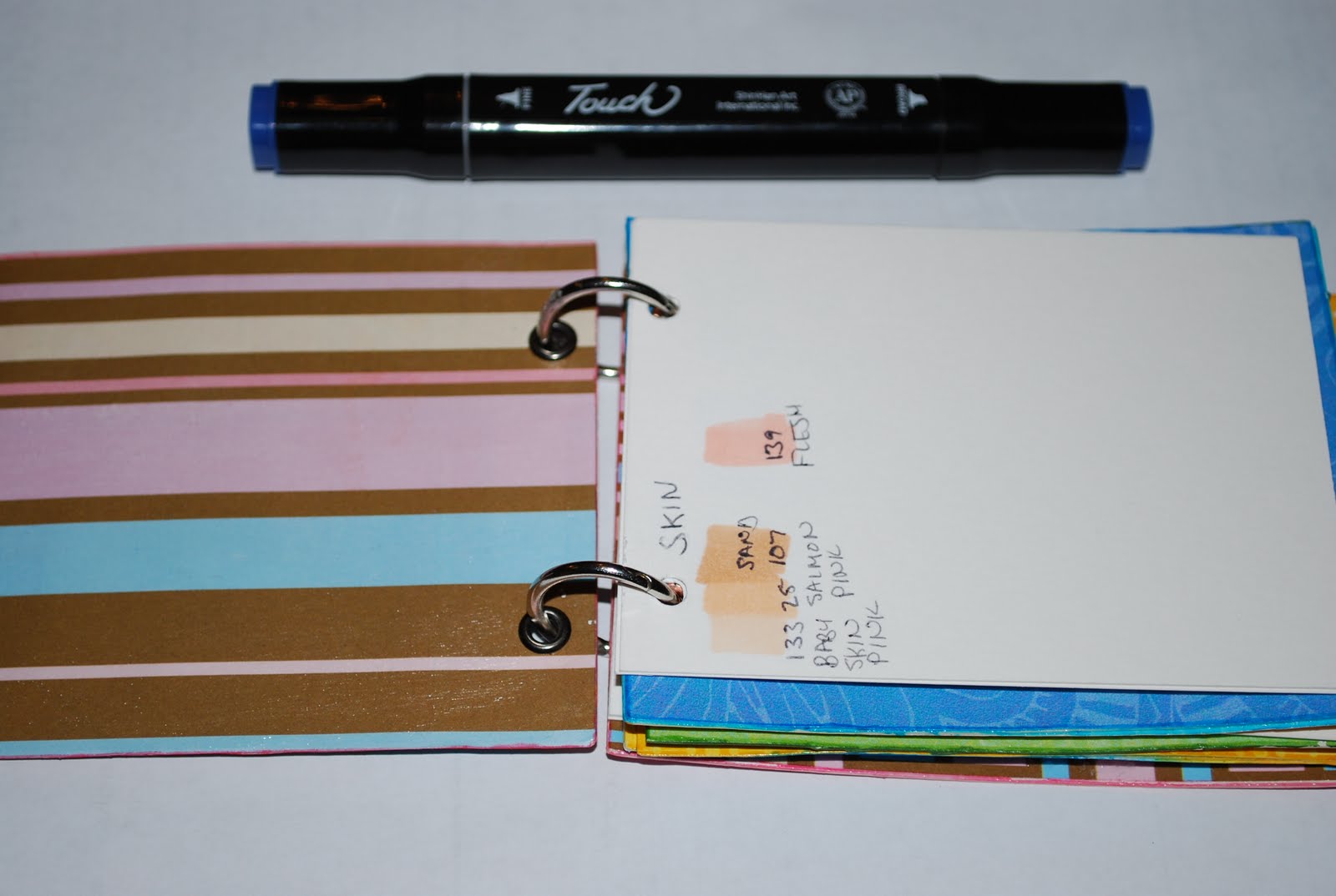

I made a mini diary album for to keep a record for all my "marker mixes" - which colors to use for hair, skin, jeans, boots, trees, etc. I generally use 3 or more colors when blending. It is just easier to keep a record instead of figuring it out every time - although that does create some pretty neat discoveries.
The photos loaded backwards, from open to the front cover! I haven't decorated the cover yet but it is a cute, sturdy little book. I used glossy Collage Pauge and it is a strong seal and hold up very well.
Happy New Year! May 2011 be the best EVER!
Wednesday, December 29, 2010
Love my Shinhan Twin Touch Markers

I have been doodling a bit with my Twin Touch alcohol markers. They are great, colors are transparent so they can be blended together. Colors are vibrant and they are much more reasonably priced than Copics but on the same quality level, in my opinion.
Black hair seems to be the most difficult so I have been practicing and I am happy with how this girl turned out. I love the vibrant colors so I made a calendar with the verse Eze 34:26.
Monday, December 27, 2010


Sunday, December 19, 2010
Cool Studio 3 Color Cubbie give away @ Wee Memories

Great giveway http://suchins.blogspot.com/. I could really use this to control my marker madness mess! :)
Subscribe to:
Posts (Atom)